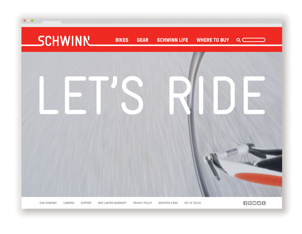
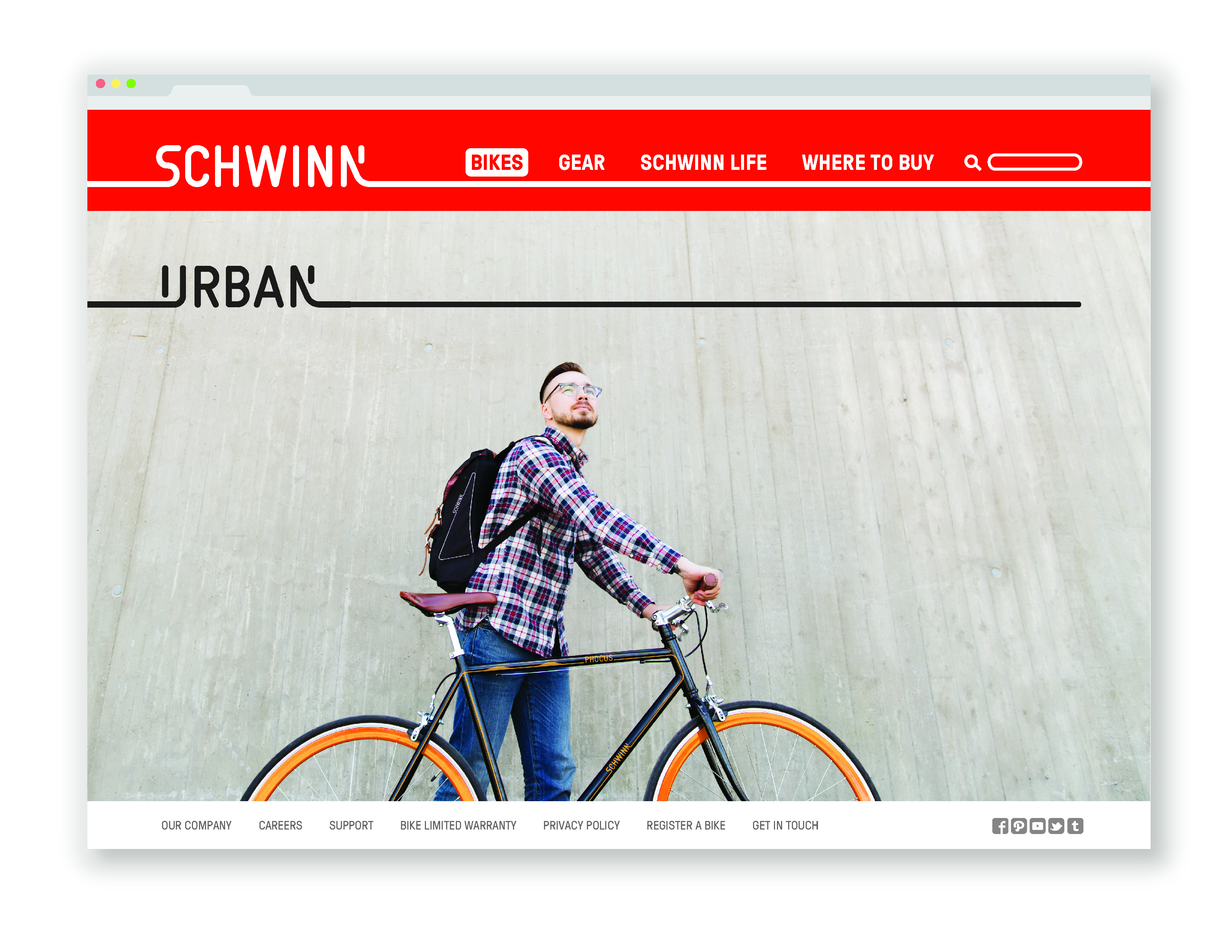
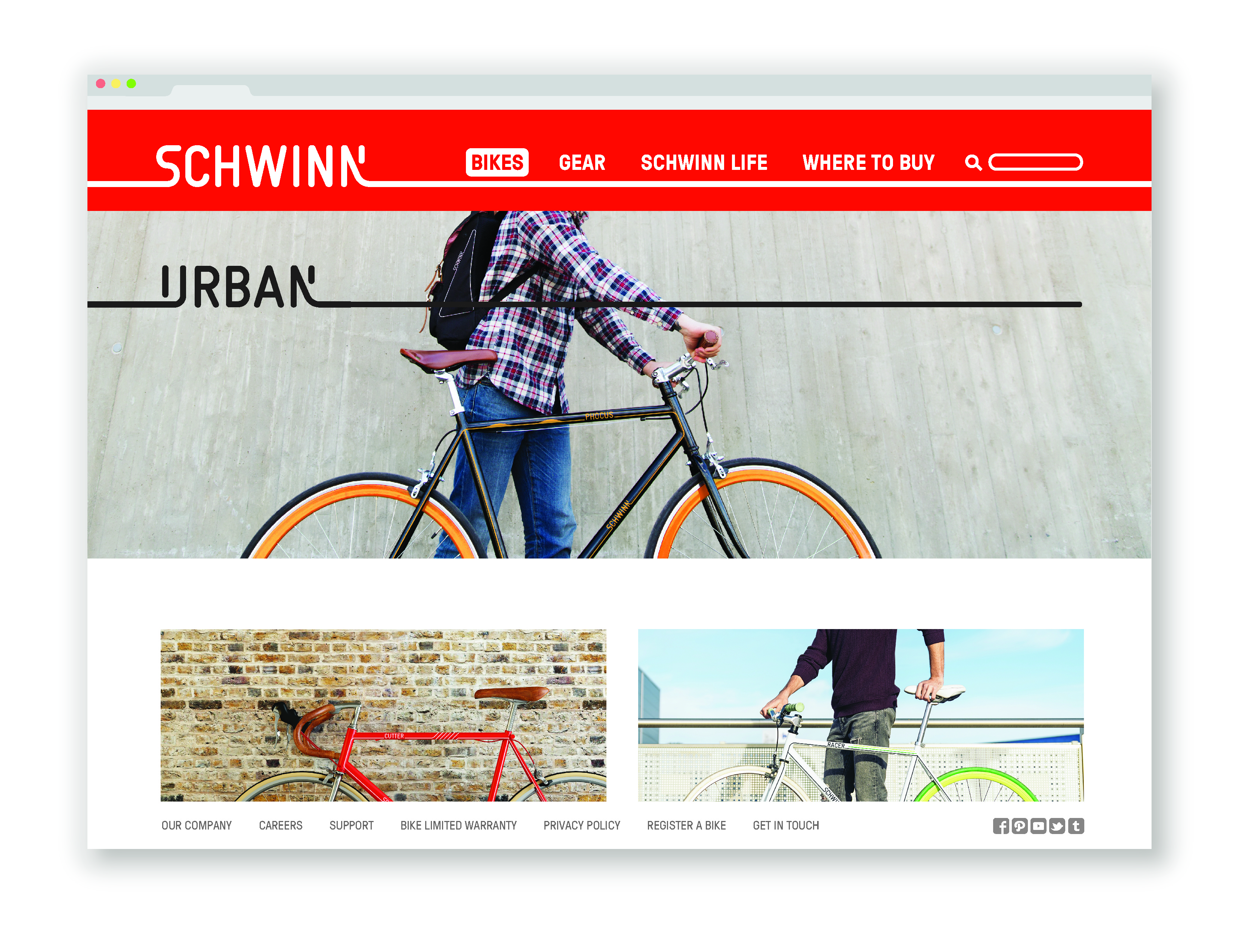
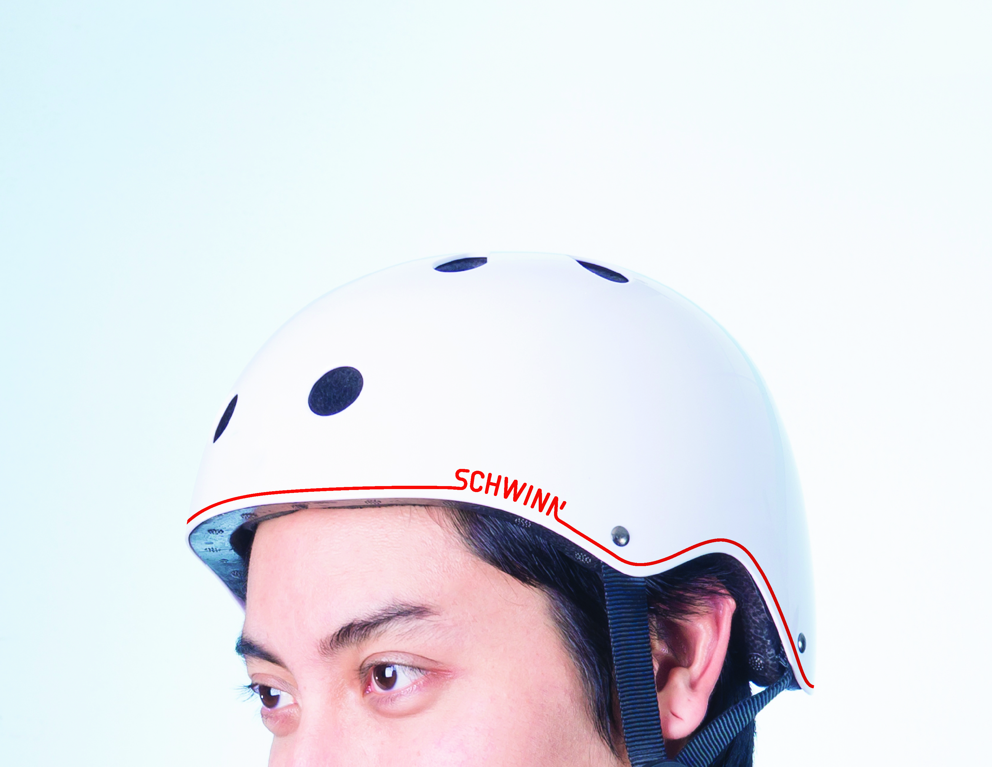
branding
Scwhinn
2015
When researching Schwinn's brand history, I discovered that they use many of their past logos in current branding. They lack consistency in application, and that is not what Schwinn needs as bike culture increases in popularity. I wanted to create a logo that was maleable and could be applied across a wide range of products without becoming boring, and would still reflect on the brand's history.
The final logo has elements of Schwinn's oldest logos with scripted lettering, but is still sporty and current with plenty of indicative motion. Throughout the applications, I created custom letterforms and used the lines of the logo to follow the form of the products. The flexibility of the line can be seen on the bikes, where it creates pattern, expands, and repeats.