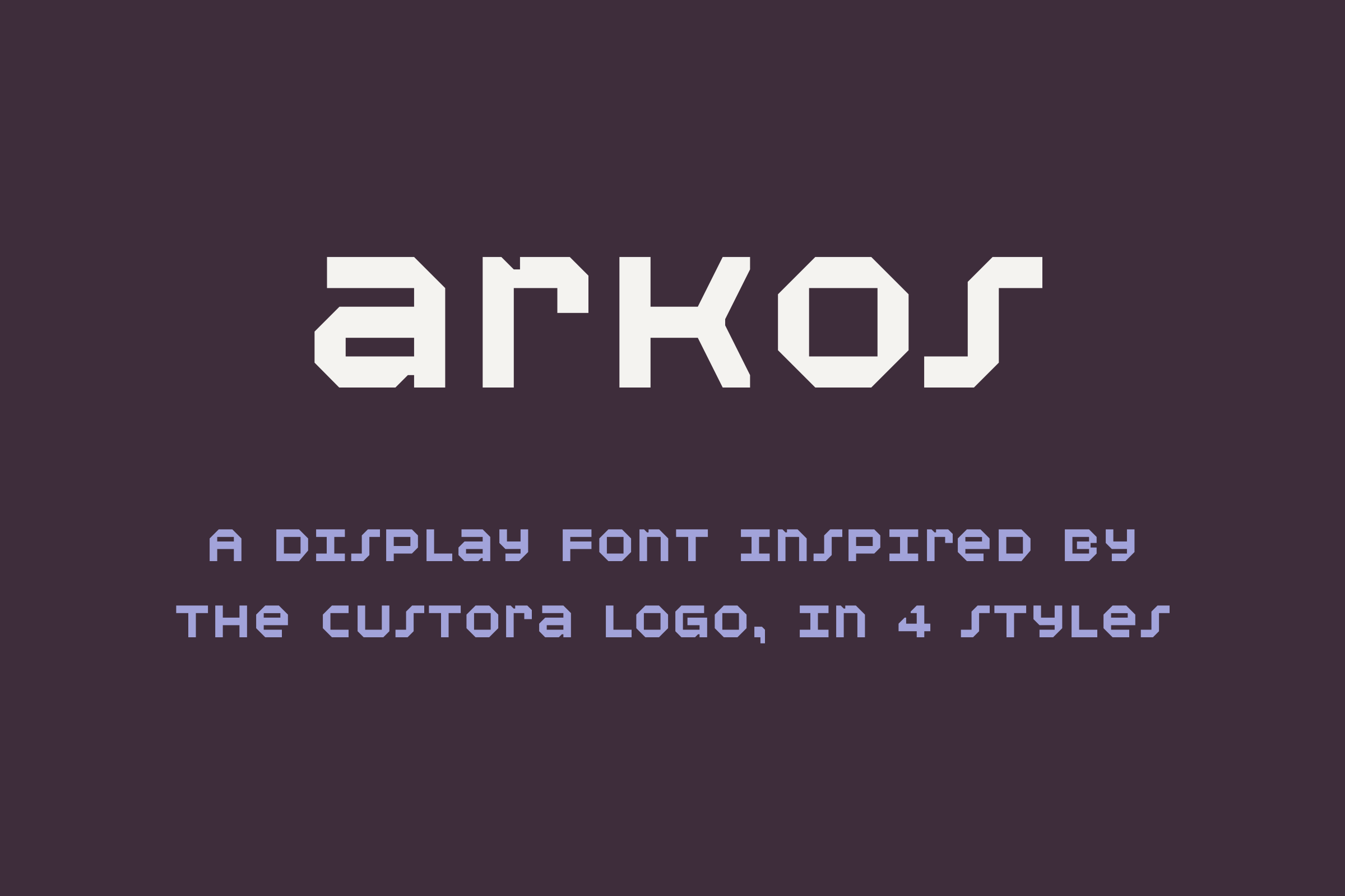
Arkos Typeface
2018Arkos began unintentionally when redesigning the Custora Logo. Although in the end only the ‘t’ and the ‘a’ changed in the logo, the process involved redrawing all the letterforms and testing other solutions. We had 7/26 letters then, and creating the rest became a passion project.

Process
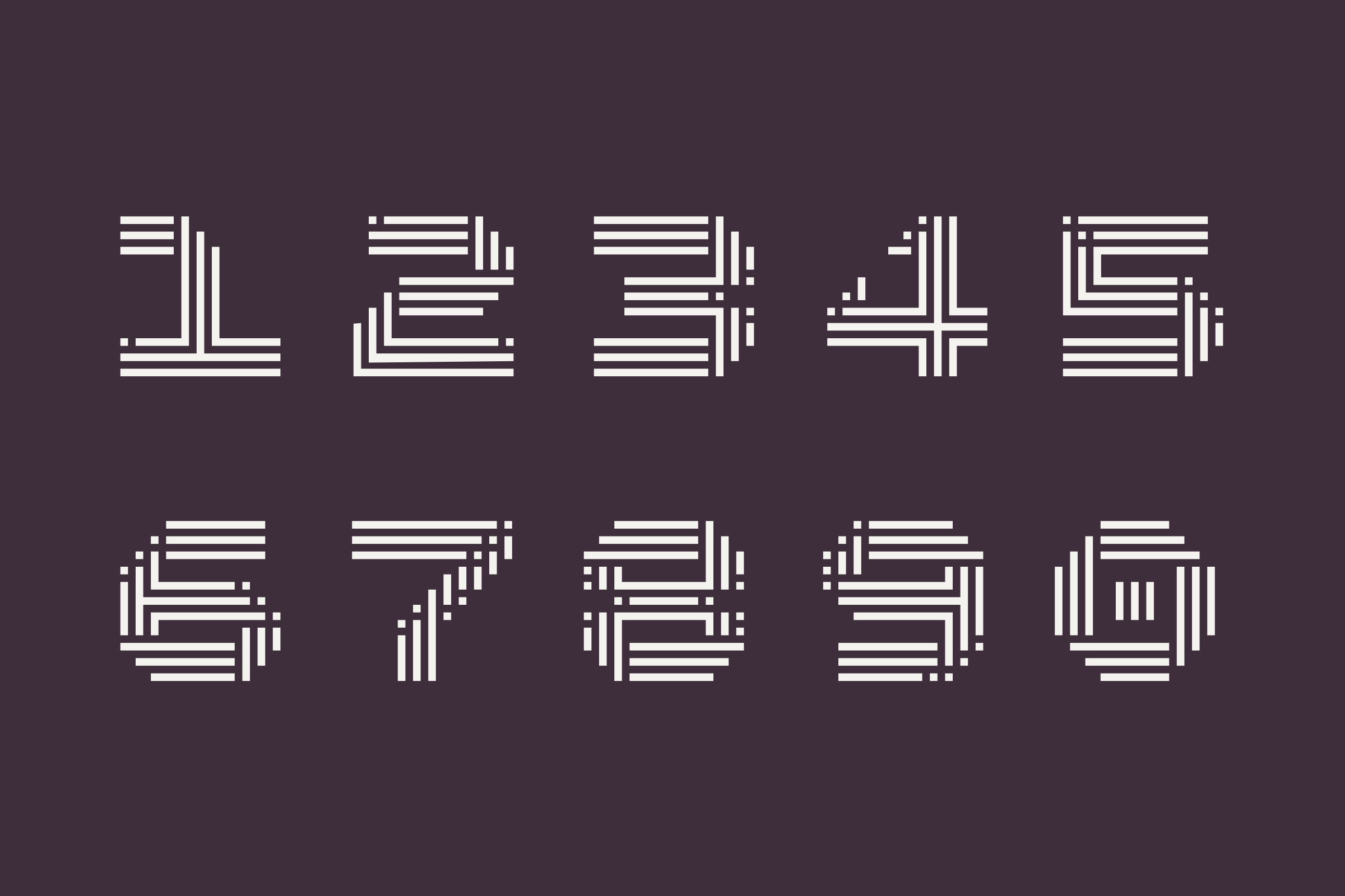
The geometry of each letter is based on a 11x11 pixel grid with equal spacing between each pixel. Initital sketches started in Illustrator by taking the full grid and removing pixels to form the shapes, using a few rules informed by the Custora logo:
-
Letter thickness is equal to three pixels.
-
Counters are made by removing three by three pixels, and eyes are made by removing one by three.
-
All edges must be on or a multiple of a 45 degree angle.
-
All ‘rounded’ edges are three or four pixels long diagonally.
The rules evolved when reworking the type in Robofont, creating new styles, and adjusting for flow and readability.


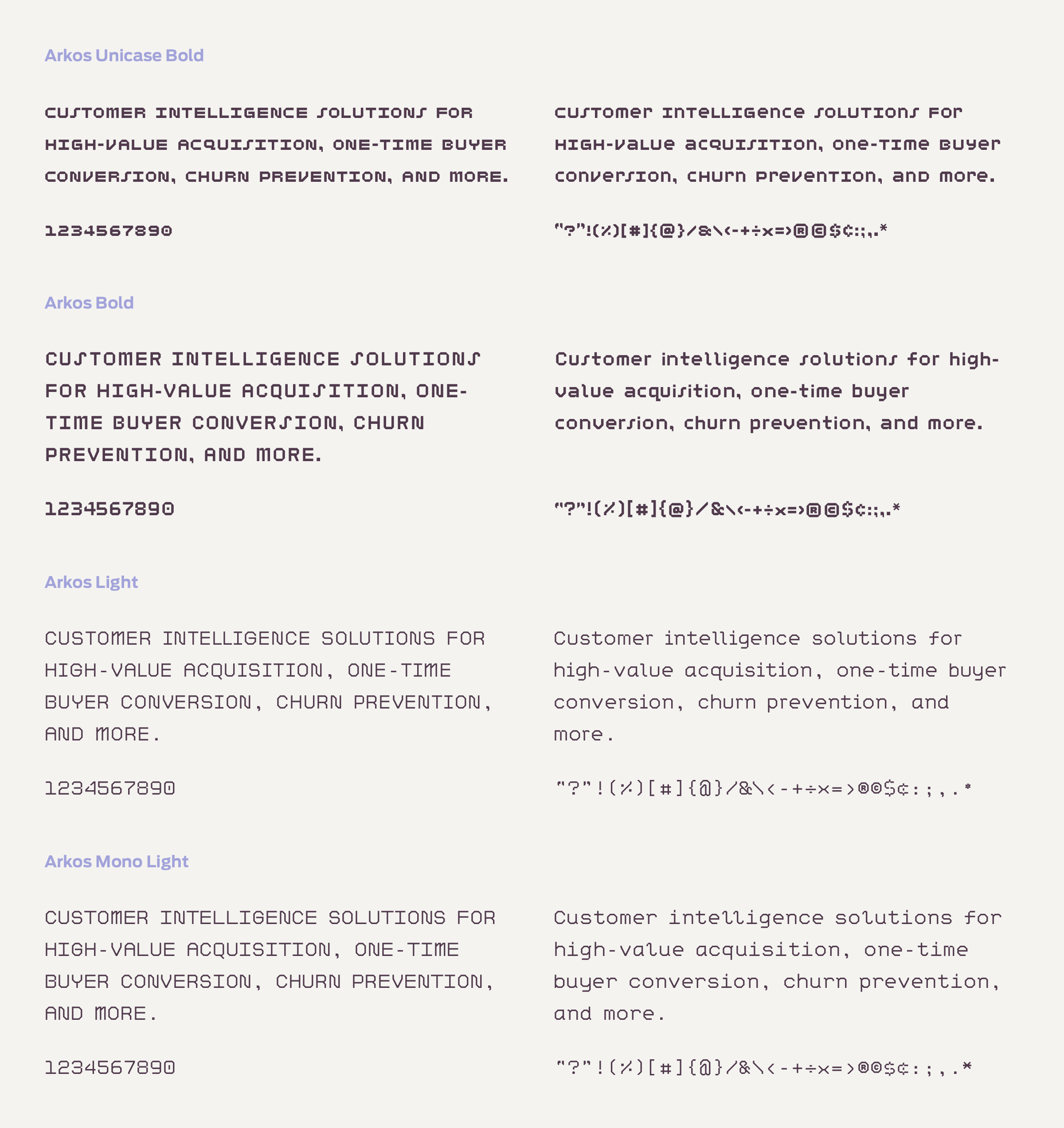
Arkos in Use
Arkos Unicase was mainly used as a tagging system for web, print, and video marketing collateral, company events, office signage, and as the main font for the 2019 CARMA conference hosted by Custora.