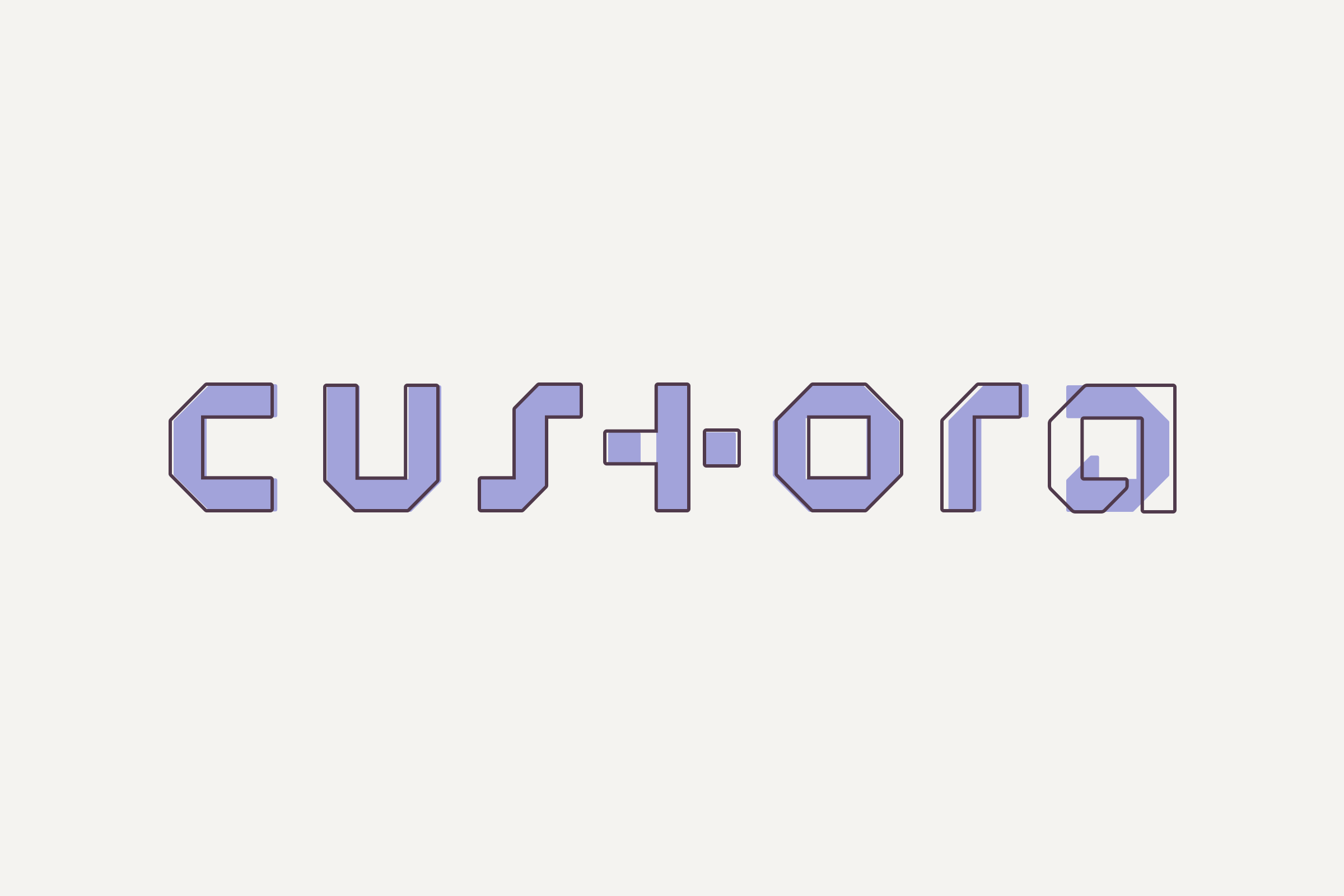
Custora Logo
2018Redesign for readability.
We decided to update the Custora logo after receiving feedback that it was difficult to read. The main issues were the ‘t’ being confused with a ‘+’ and the ‘a’ sometimes reading as a ‘d’.
Some contraints we worked with were 1) it still had to be symmetrical with the ‘t’ landing in the center and 2) each letter and the kerning between had to be based on a pixel grid. In aiming for readability, we also strove to bring more balance to the ‘t’ and ‘a’ which were suffering from some awkward negative spaces.
The result was a logo that accomplished just that, through restructuring the ‘t’ to maintain its ‘+’ symbology with added weight, and an ‘a’ that looks more classic but echoes the shapes of the ‘c’ and ‘o’.
This projected prompted us to create the Arkos typeface.

